LA Art Book Fair

Immersive media

Immersive media

Year

2024

Info

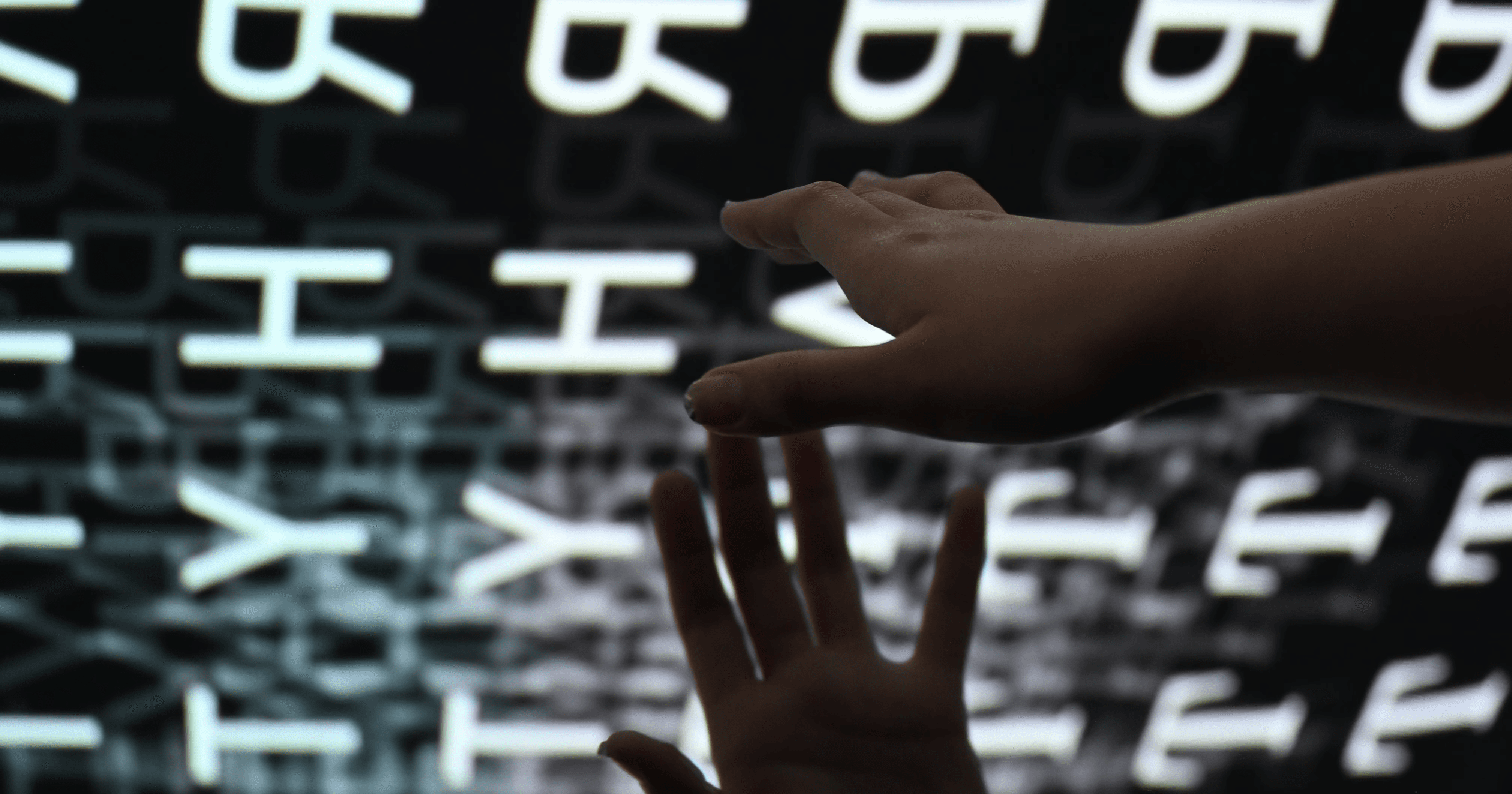
This project explored how coding can expand the boundaries of graphic design. Our goal was to create an interactive title wall for the LA Art Book Fair that felt alive and responsive to visitors; turning static identity into a collective, digital experience.

The audience included artists, publishers, and fair visitors who interact with design daily. The wall invited them to participate in the work itself, shifting the fairs identity from something to look at into something to engage with.
Try the title wall here

The title wall was built to translate the LAABF identity into an interactive experience at scale. Each color responds to a hue range pulled from the brand palette, and every moving element is constructed from letterforms in the logo. As visitors step into the frame, the wall generates new patterns with their silhouette, letting them feel as if they’ve entered someone else’s chapter while writing their own in real time.

The title wall was built to translate the LAABF identity into an interactive experience at scale. Each color responds to a hue range pulled from the brand palette, and every moving element is constructed from letterforms in the logo. As visitors step into the frame, the wall generates new patterns with their silhouette, letting them feel as if they’ve entered someone else’s chapter while writing their own in real time.

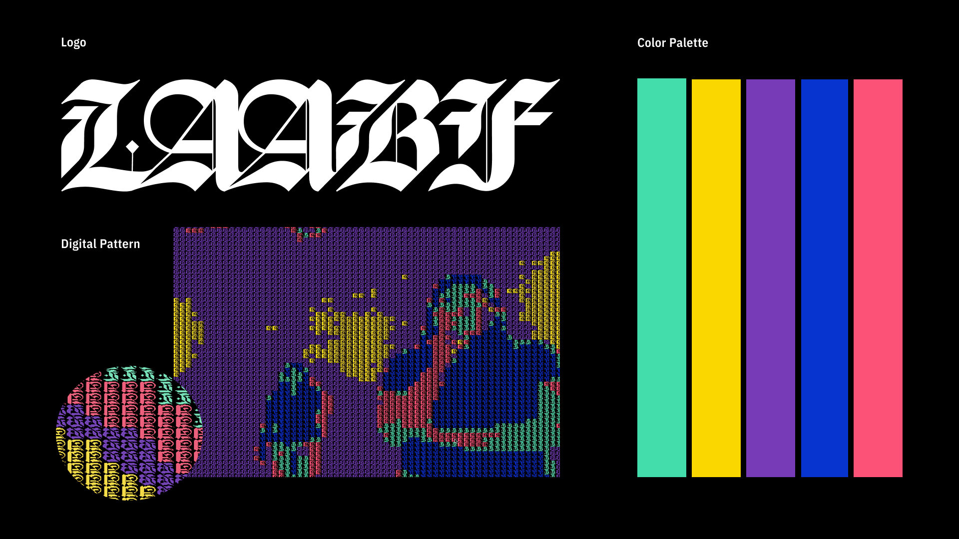
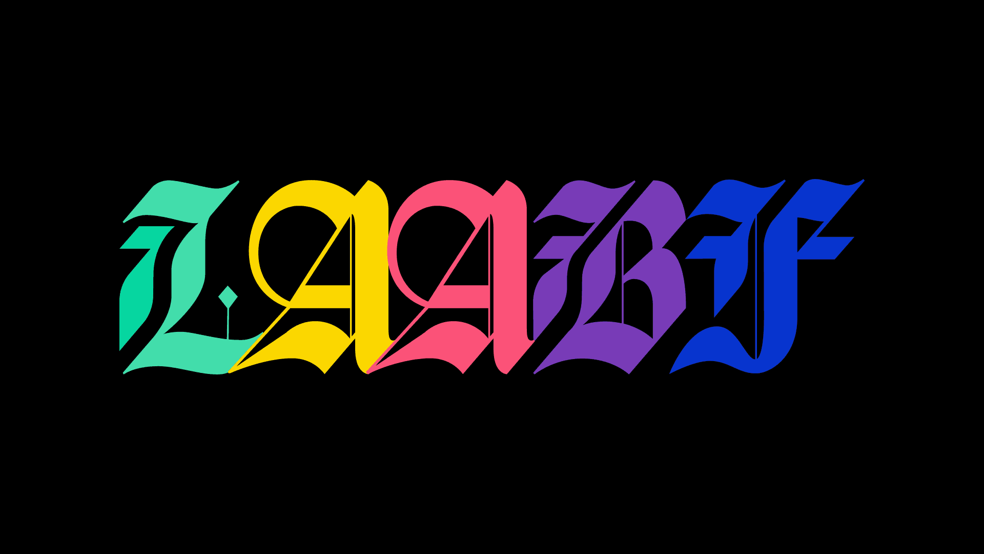
The brand language combines a blackletter logotype that references the history of bookmaking with a set of bright, contemporary colors that represent the current energy of LAABF. The visual system bridges past and present, pairing traditional forms with digital patterns generated for the interactive title wall.

The brand language combines a blackletter logotype that references the history of bookmaking with a set of bright, contemporary colors that represent the current energy of LAABF. The visual system bridges past and present, pairing traditional forms with digital patterns generated for the interactive title wall.

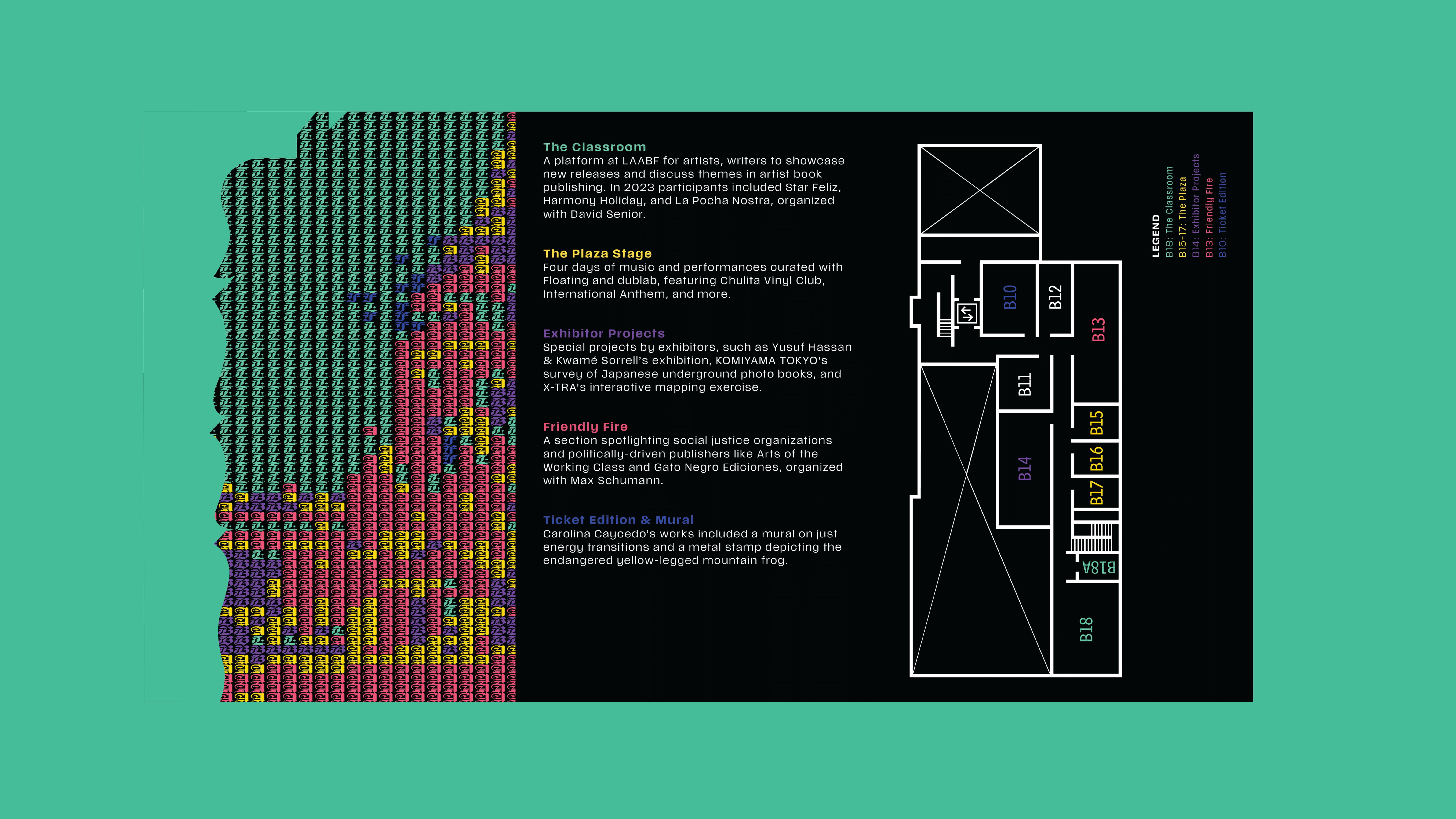
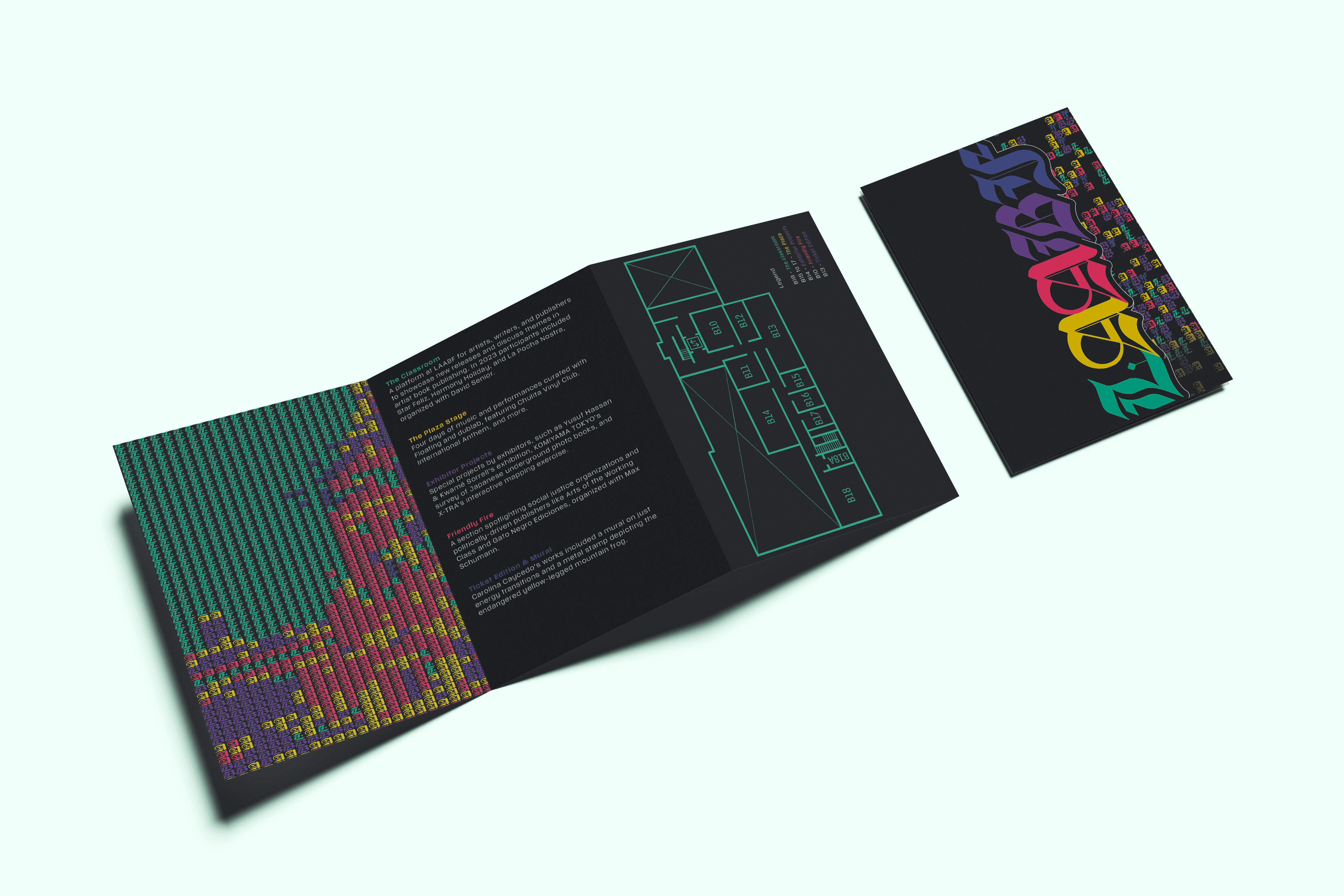
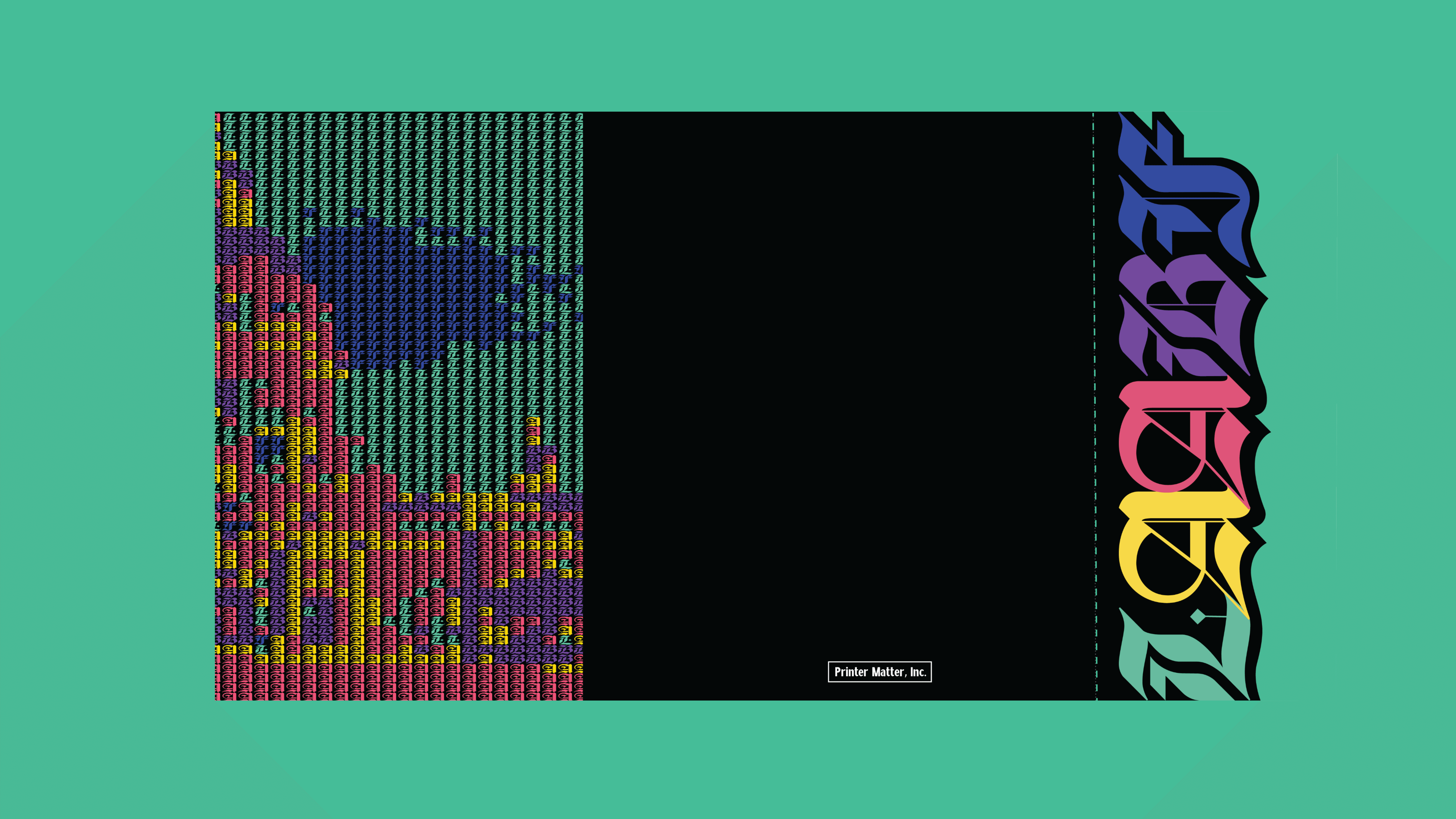
The catalogue was created for the Printed Matter's art book fair. The cover features a hue-mapped rendering of Pasadena City Hall, built with the same letter-based system used in the title wall. The right edge includes a perforated strip designed to be torn off and kept as a bookmark, extending the fair experience into something visitors can carry forward.

The catalogue was created for the Printed Matter's art book fair. The cover features a hue-mapped rendering of Pasadena City Hall, built with the same letter-based system used in the title wall. The right edge includes a perforated strip designed to be torn off and kept as a bookmark, extending the fair experience into something visitors can carry forward.